Who explains the World?
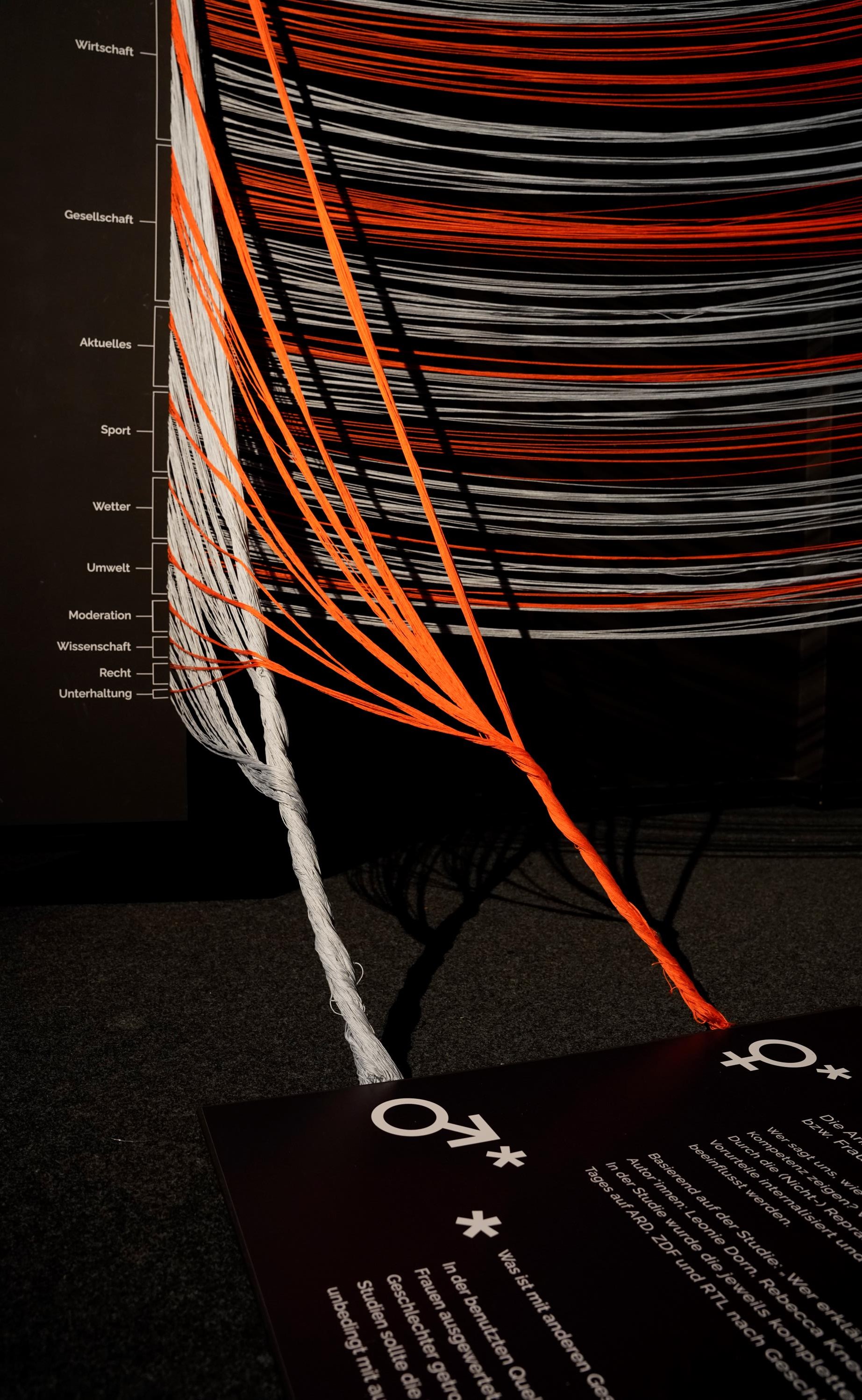
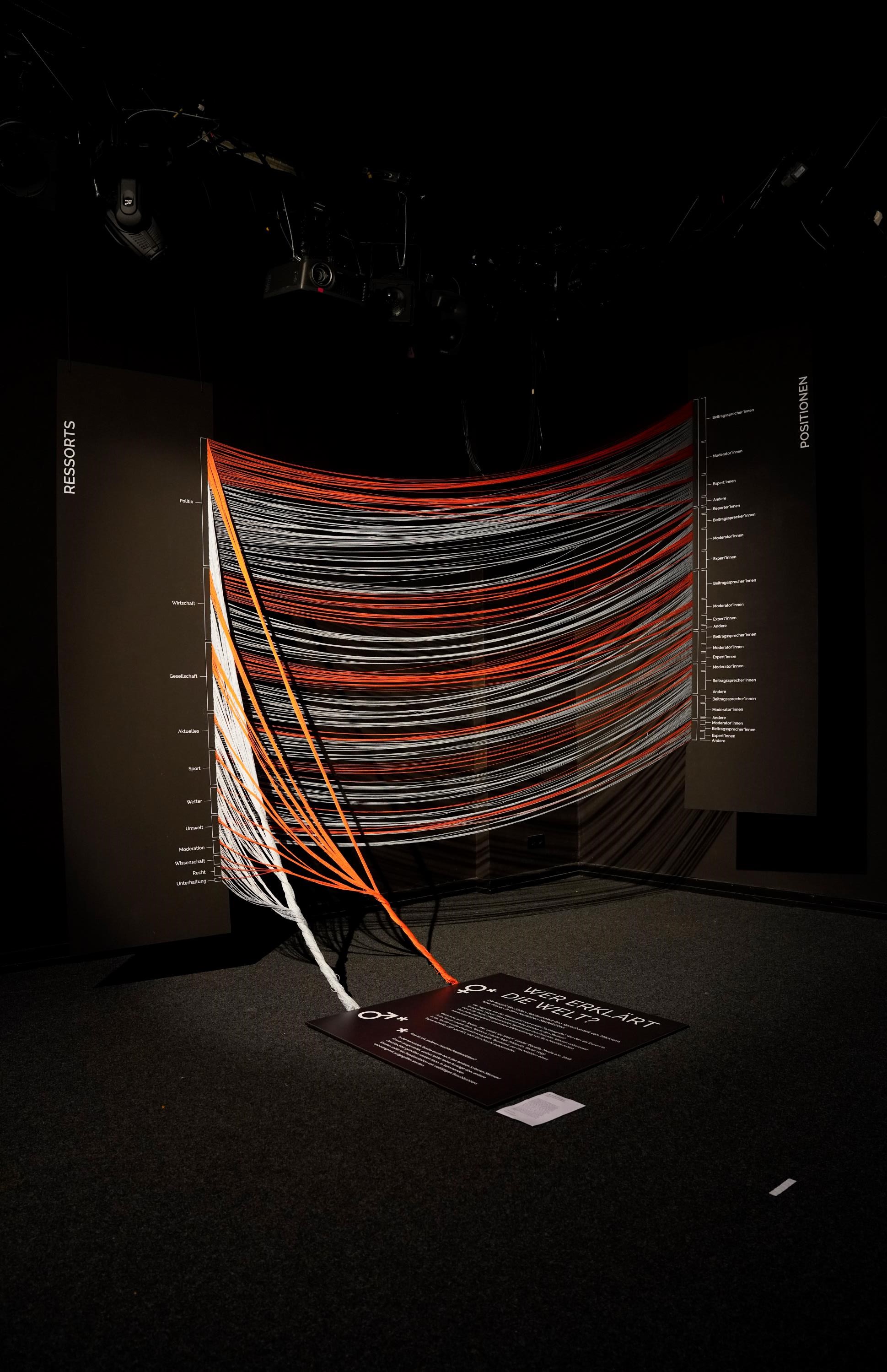
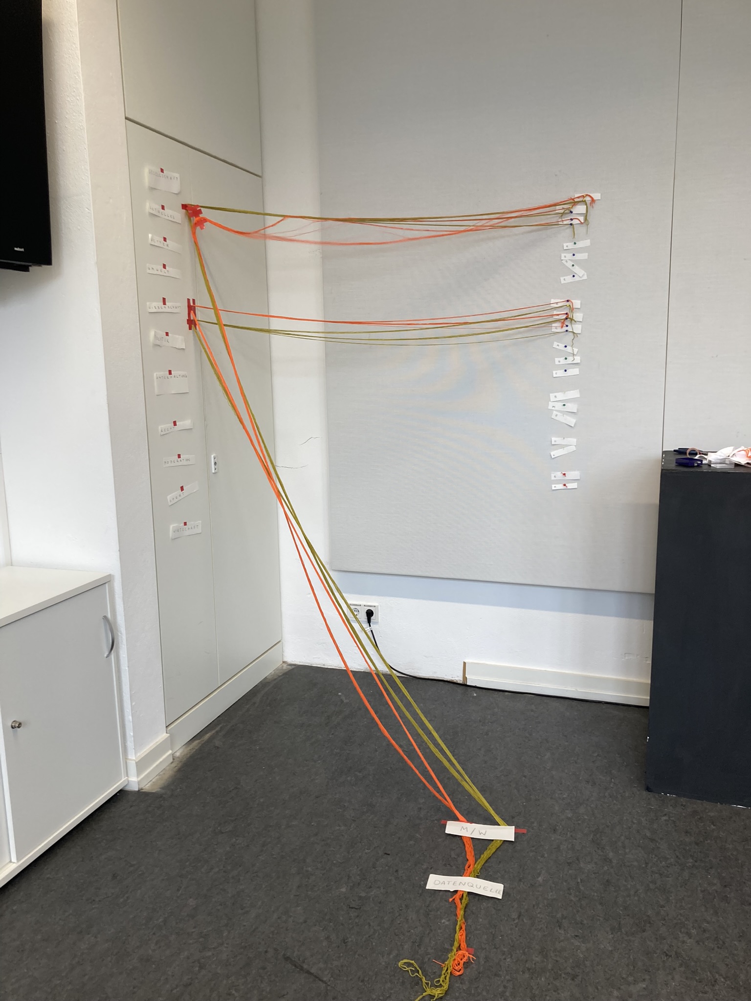
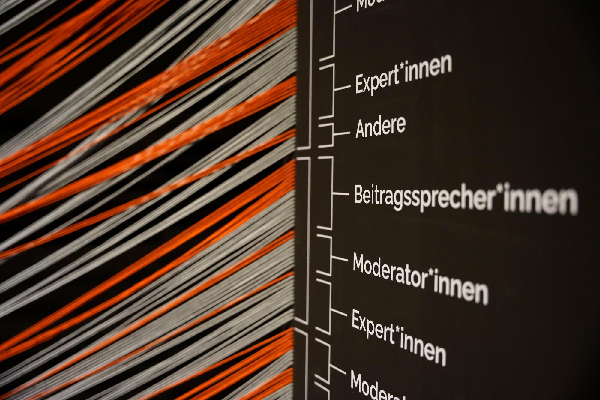
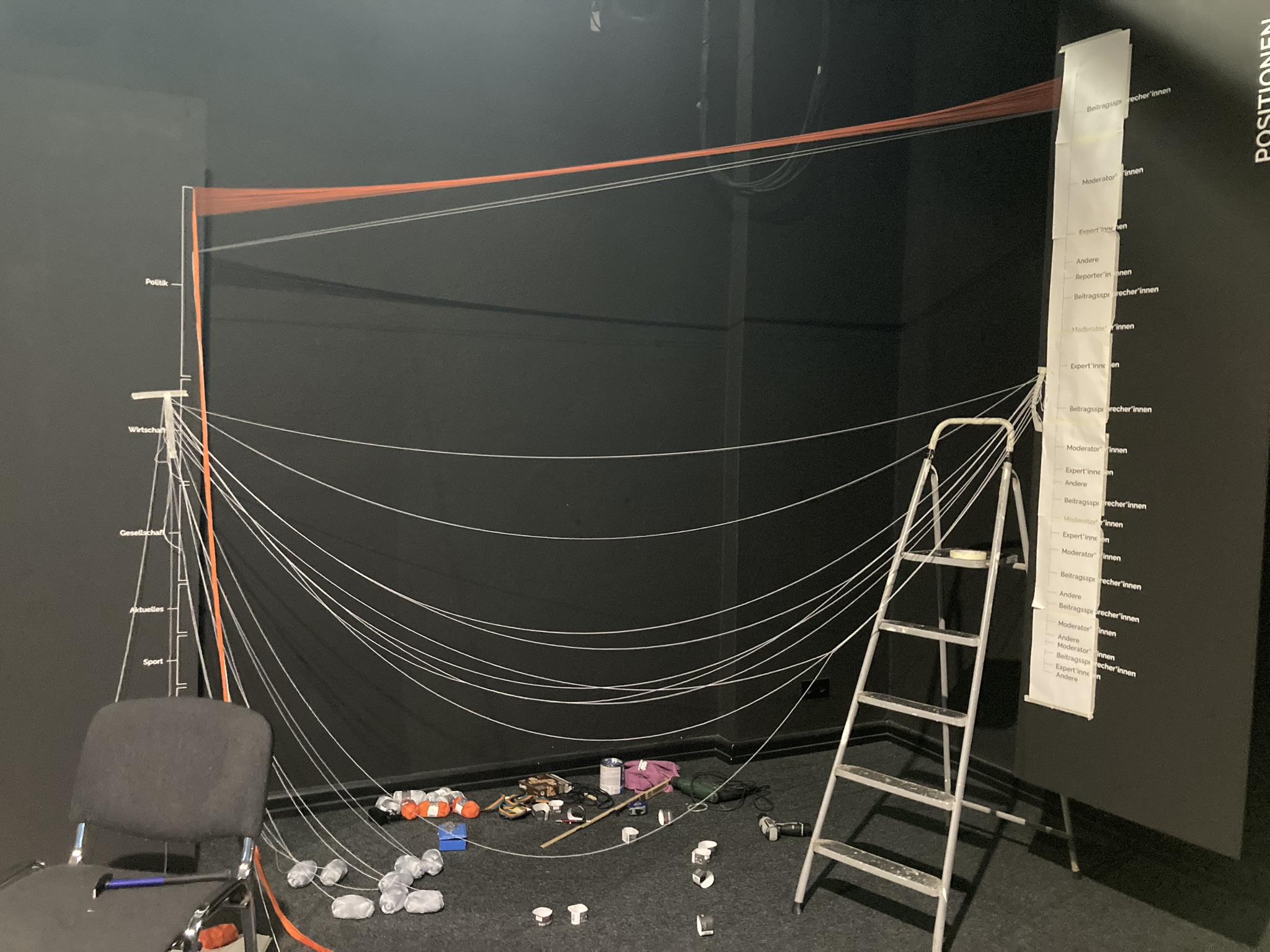
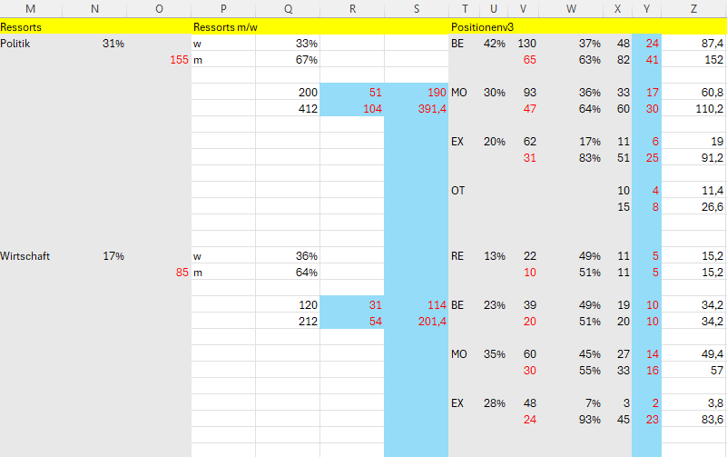
The piece visualizes data about the proportions of speak time between men and women in German TV news. It uses threads of different colors that start from the same source and then go into more and more detail.
| Year | 2024 |
| Material | Threads, Wooden Boards, Wall Paint, Foil Plots |
| Production/Tools | Miro |
| Dimension | 2 x 4 m |
| Contact | the.guenther@gmail.com |
Motivation:
I wanted to create a literal physicalization of data. There were mutliple reasons:
First of all, I wanted to „feel“ the data in the process of creating the sculpture. Secondly, I was interested in the patterns data can create when put into a formula of color and space; I was curious what the result was going to look like, because there was no way of knowing it beforehand. And lastly, I wanted to create a piece of information that is accessible and understandable on different levels of detail, pulling in the audience and motivating them to move around the sculpture while „grasping“ the information.
Reflections:
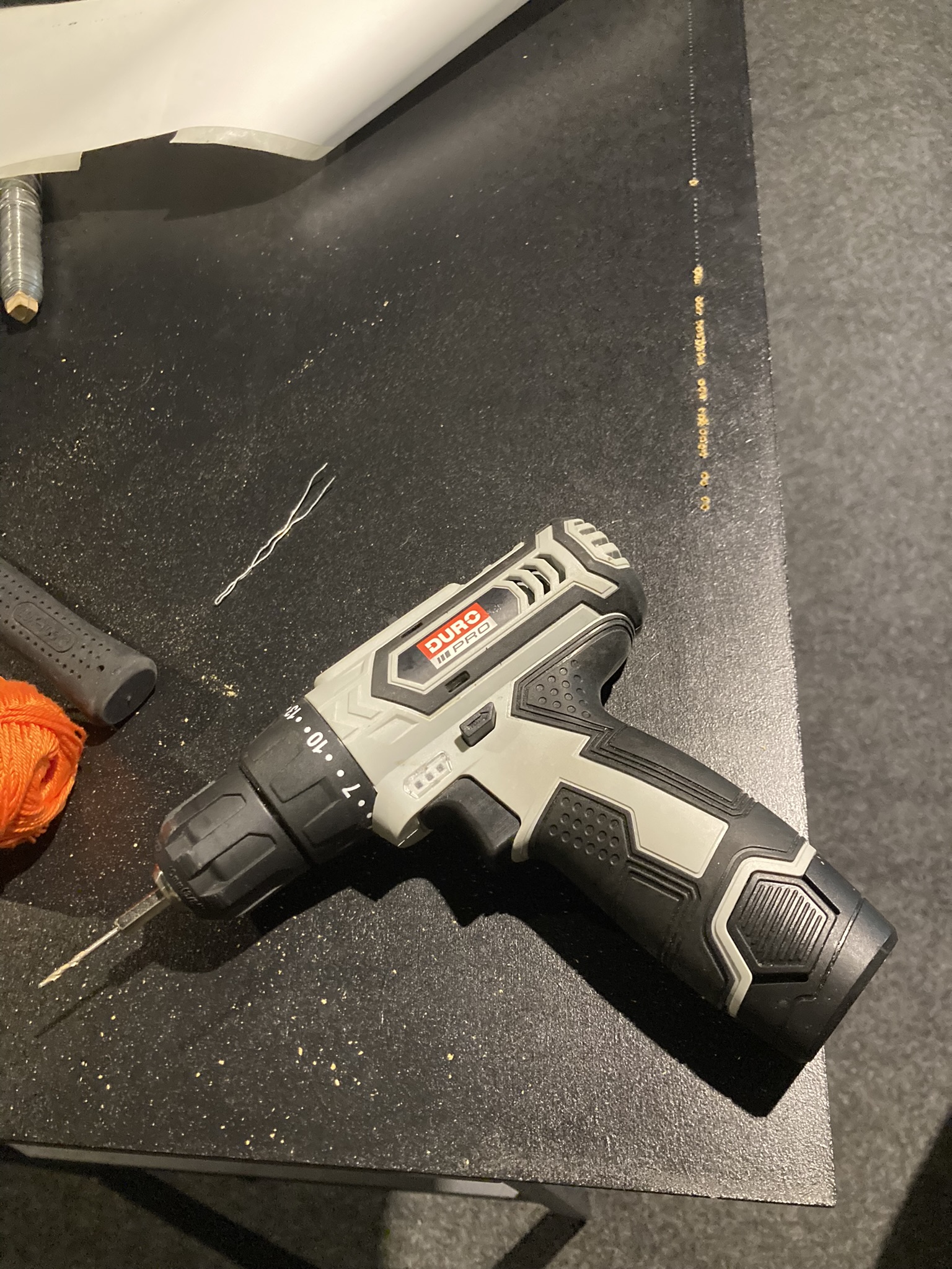
It was very refreshing to build something completely by hand, especially with the data involved. The planning and execution were much more complex, and there were more factors involved. For example, I hadn‘t thought about the strength the 500 yarns could develop, and they ended up pulling the two boards together with their own weight. But it was a very interesting experience, and seeing people being fascinated by it was a reward. It definetely had another effect than „just“ a screen somewhere.